LOGOS
Logos are my newest venture into Graphic Design. It’s a big responsibility to create the graphic that will be the face of a brand. From font, to color, to overall design, logos are quickly becoming something I am seeking out in order to tackle more of them.
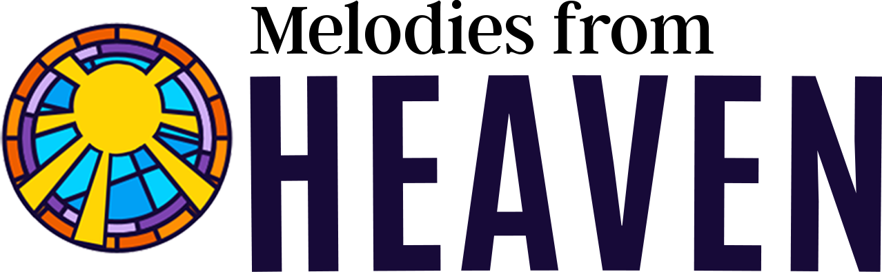
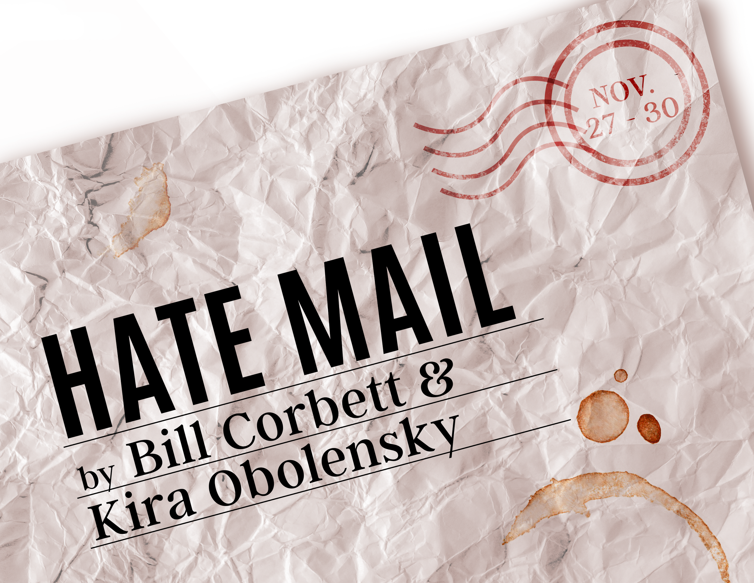
These are some of the many logos I created for specific Special Events at Tipping Point Theatre while working as their Marketing Director. I enjoyed working within their style guide for the majority of the time while finding opportunities to switch it up when possible.
Tipping Point Event Logos
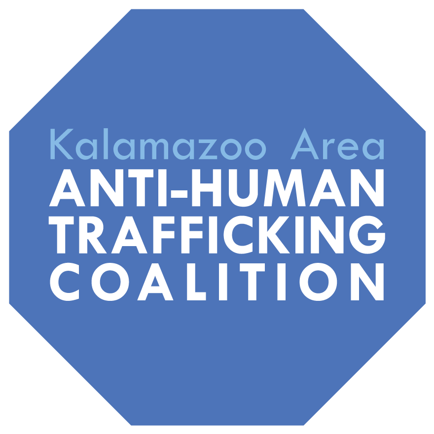
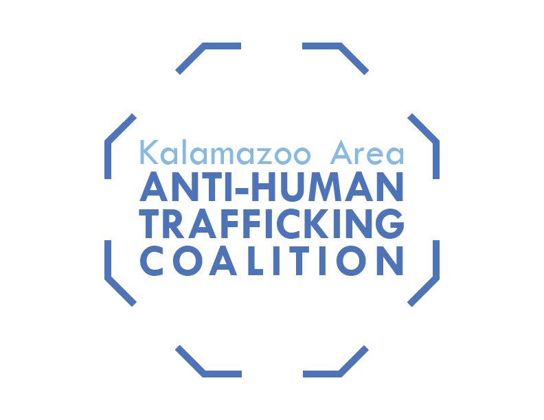
The Kalamazoo Area Anti-Human Trafficking Coalition is a nonprofit organization that educates the Greater Kalamazoo Area about the realities of Human Trafficking happening right in our backyards. They host meetings, train medical and other professionals who would most likely come in contact with survivors and connects survivors to area services.
This organization is near and dear to my heart. They have helped so many people in my hometown and raised awareness on this difficult topic throughout the community. When approaching their logo redesign, there was a clear want for to focus on the positive side of what the organization does. We didn’t want to do red or any alarming colors and looked towards other organizations for guidance. I eventually landed on blue tones, drawing connections to the National Human Trafficking Hotline. The shape had many forms, but we eventually landed on using a stop sign to signify their actions towards stopping this new form of slavery.
FINAL
LOGO
FIRST
DRAFTS
KAAHTC
Kalamazoo Area Anti Human Trafficking Coalition
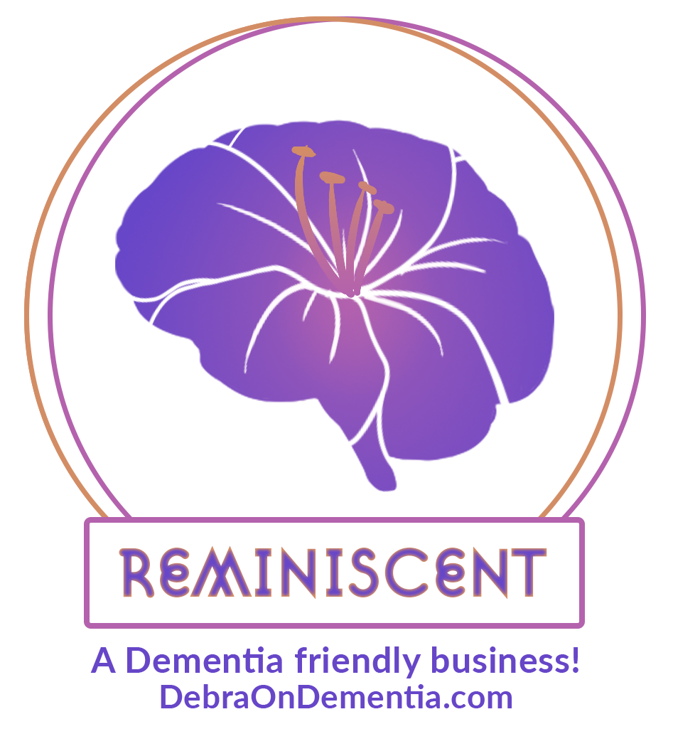
Reminiscent is an organization dedicated to educating people about Dementia and supporting those who have it.
It was important to the client to keep the shape of a brain while finding inspiration from Georgia’s state flower, an azalea. Pulling color from a reference photo and drafting a few ideas, the two organic objects soon began to mesh together until we got to the final design.
FINAL
LOGO
FIRST
DRAFTS
REMINISCENT

The Wu-Tan Clan was my husbands team name at Quicken Loans (now Rocket Mortgage) during quarantine. A pun on his last name, Tann, his colleagues had the opportunity to vote on what team name they wanted to be known as. The decision was unanimous and I decided to make a logo to commemorate it!
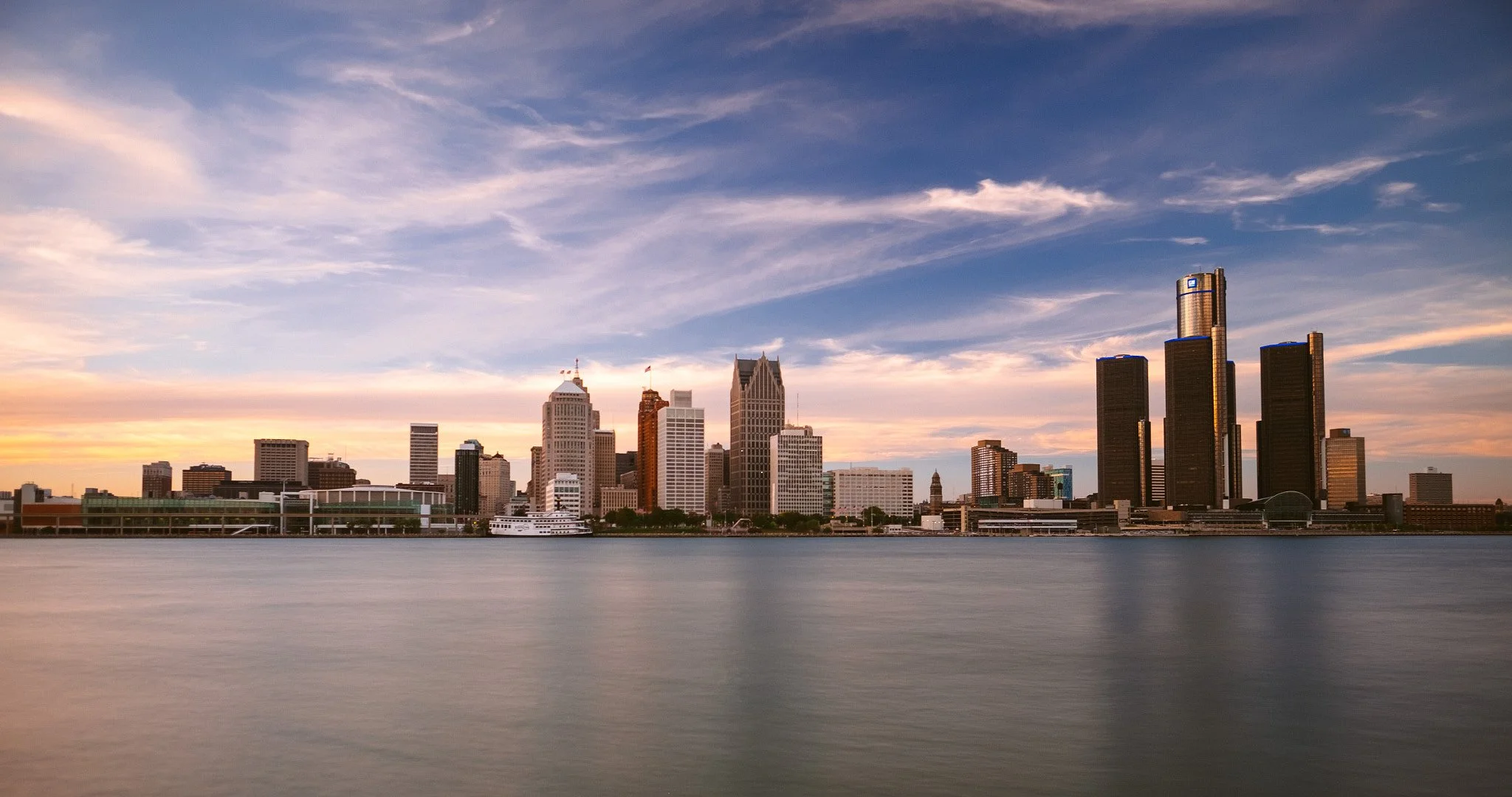
This project was a lot of fun for me. It gave me the opportunity to explore more of my artistic choices without meeting a client’s expectation. I took Wu-Tang Clan’s iconic logo and started searching for fonts with similar characteristics. Once that was done, I wanted to add in a little piece of the city, opting for the Detroit skyline. and the Quicken logo. The design was intended for shirts and other merchandise for the team to commemorate their time together.
FINAL
LOGO
INSPIRATION
Wu-Tan Clan
A Rocket Mortgage Team